Wednesday 19 December 2012

Evaluation Question 7

Please listen to this podcast of my answer to question 7. Below is a transcript with images for you to look at while listening.


Question 7: Looking back at your preliminary task, what do you feel you have learnt in the progression from it to the full product?


When you look at my two magazines side by side you can clearly see that one looks more professional and well made than the other. I think the areas that I have improved the most in since my preliminary task are use of colours, Time Management and product development.


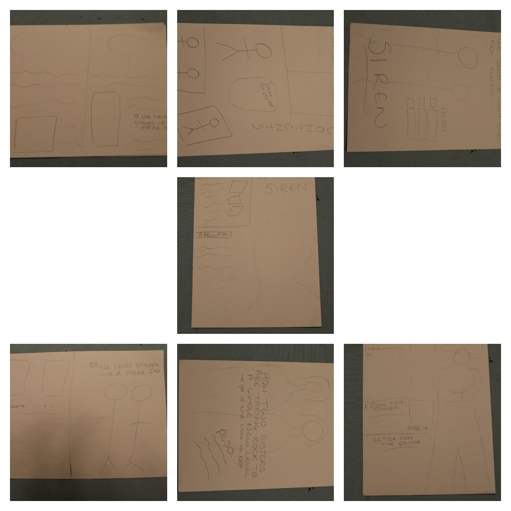
In my planning for my preliminary task I only made 7 blog post whereas for my main task I made over twenty. My main task posts weren't just better because I had more of them; they were also better quality. They were shorter and more concise making it easy to track my progression in the production. In my preliminary task I didn't think much about timings, making it hard to set myself deadlines. In my main task however, I made a detailed time plan that I stuck to, thus making it easier to keep control of what I was doing and when.


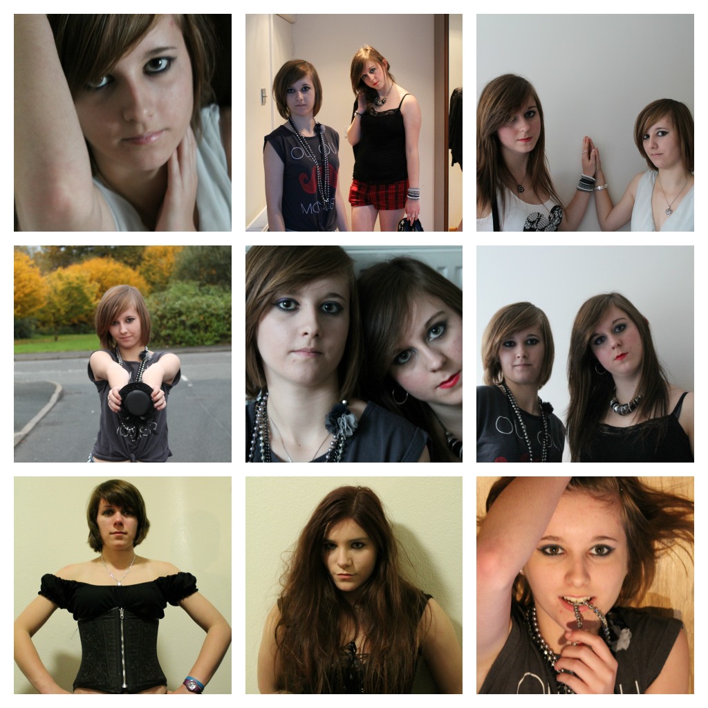
My photography skills have improved since the preliminary task. As you can see, I only used one pose and location for my preliminary task, this meant that I didn't have a lot of choice when it came to selecting a cover image. I kept  this in mind when it came to taking photos  for my main task and ended up taking over 100 hundred photos, which when narrowed down to usable good quality photos, came to 25 different shot types to chose from. This helped as I had a lot of trouble choosing an appropriate cover image, without the variety of photos I would have had to my photoshoot again and waste valuable production time.


In my preliminary task I used only the magnetic lasso and shape 
tools to create my cover. This made my cover looked washed out and a bit boring. Whereas on my main cover the colours stand out more. The same can be said for my contents page. Also on my preliminary magazine, there are mistakes that you wouldn't find on a professional magazine, such as bit of background left over on the image. I however learnt from these mistakes and made sure not to make them again. 


Using InDesign in my preliminary task was a great help, as without experience I would have struggled when it came to my main task. I was glad to have a practice run where I could learn the basics and then develop my knowledge on features such as the text warp in time for my main task.


Overall I have found that my main task required more attention to detail than my preliminary task. However I think that I have managed to produce a professional magazine that attracts it’s audience well. And I feel that achieved the targets that I set my self at the end of the preliminary task. 

Evaluation Question 6


Saturday 15 December 2012

Evaluation Questions 4 & 5


I feel that I was mostly successful in attracting my audience. As when I showed it to members of my target audience I received a lot of preferred readings. For instance on my front cover my audience was drawn in by the simplicity of the design as they felt it was less cluttered then most other magazines. My audience also liked the title ‘Siren’ as it connoted both power and beauty which is how my audience see themselves. The use of colour through the magazine was successful as the black, red and white made the magazine recognizable as a rock magazine, and the purple then narrowed the genre down even further to female rock. So my audience felt it was clear who the magazine was targeted at. I made my models look strong and confident and my audience appreciated this. As they said that they looked powerful instead of superficial and objectified. Something that they didn’t like in other magazines.

However I also received some aberrant and negotiated readings; mostly concerned with my fonts. As my audience felt that they styles of fonts could have been more consistent, however I was trying to show the variety in rock music through my fonts and not make it all look the same. However one member of my audience liked all the fonts used but she thought that one or two fonts could have been used more so that they didn’t stand out so much as looking ‘odd’.

The majority of my audience liked what I had done with my magazine, and they thought it was successful as a rock magazine. There were only a few criticisms. This means that I have been successful in attracting and addressing my audience, and I have created a magazine which suits it’s genre.

Tuesday 11 December 2012

Evaluation Question 3


What kind of media institution might distribute your media product and why?


Although the genre of my magazine is ‘heavy female rock’ and my audience are non-conformist, radicalists I have decided that a mainstream distributer would be more appropriate as my audience don’t have that much disposable income, they’re more likely to buy the magazine from an accessible store than a upmarket boutique.
My magazine is similar Kerrang magazine which is distributed by frontline, a mainstream company, despite it being recognised as a somewhat ‘alternative’ magazine. Kerrang is available from most major retailers such as Tescos and HMV, so my magazine will be to as my audience may not have the means to travel far to purchase the magazine, but it will also be available at alternative clothes shops, as my audience will also shop there when they have the money.

Vice magazine is an independently distributed magazine and aimed at a very non-conformist audience. Although my audience is also non-conformist it wouldn’t be appropriate to distribute my magazine in the way that Vice does. Vice’s audience is slightly older than mine and have more income since 79% have university degrees. They are also higher on the Jicnar scale than my audience is. Therefore they can afford to travel to get an exclusive copy from high end shops, my audience is more likely to shop on the highstreet therefore my magazine needs to be available on the highstreet.

Like Kerrang magazine, my magazine will have a multi-platform strategy. It would have its own website were my audience can read exclusive articles and find out tour dates for their favourite artist. My website also includes an online shop where my audience can buy things such as concert tickets which would be hard to come by elsewhere. It will also have information about the latest magazine so that my audience can use this to help them decide whether they want to purchase the issue. As my audience don’t have that much money they may not want to buy the magazine if it has nothing that they want to read about in it. There would also be a radio station as my audience may find it difficult to listen to the music that they like on other radio stations and it can also help them find new songs to listen to.

This strategy for distributing my magazine will make a positive impact on my magazine profits. As my magazine will be widely spread the charge for advertising would be higher as it reaches a large audience. There would also be money made in advertising both on the website through banners and side advertisements as well as on the radio. Profit can also be made by charging record labels a small fee to sell their tour tickets through the Siren website. 

Evaluation Question 2


Thursday 6 December 2012

Evaluation Question 1


  1. In what ways does your media product use, develop or challenge forms and conventions of real media products?


To answer this question I have made a video. Click below for it to play. The quality can be improved by clicking the small cog shaped button in the bottom right hand corner and then selecting 720p HD. 


Here is a transcript of what is being said in the video:


In my magazine ‘Siren’ I have included a number of different conventions to make it recognisable as a professional music magazine.
On my front cover I have obscured my masthead in a similar way to both Decibel and Kerrang magazine, the magazine’s that I Researched earlier in my project.
I have also included Screamers, reversed out coverlines and a main sell, as well as a price, issue number and barcode.
On my contents page I have used subheadings to organise the content, I have seen this used in almost all other magazines.
My double page spread include magazine conventions such as drop capitals, pull quotes and columns. I used only one image down the right hand side of the page to match my research into magazine’s like Decibel which had one image down the side of the page.
All of these features set my magazine out as professional looking and realistic.
The genre of music that my magazine represents is metal. To show this in the front cover I have used a dark background, a model with a serious almost angry face. And I used the colour red in places to represent the aggression and anger which is associated with the genre.
However I also wanted to challenge the metal genre. When most people think of metal they conjure up images of tattooed men with beards and motorcycles. Instead of sticking to this stereotype. I only used images of girls throughout my magazine. I also used feminine colour purple in my magazine.  This is because I wanted my magazine to appeal to young female adults who like metal music.  Although I kept more masculine colours such as red and black as these have connotations of power, the women who would read my magazine also like to be seen as powerful.
The fonts that I have used in my magazine interchange between serif and thin to sans serif and bold. The bolder thicker fonts are representative of the metal genre. But I also included some of the serif, thinner fonts because they are more associated with magazines aimed at women.
On my double page spread I have both used and challenged metal magazine conventions. I have replicated the pose in this double page spread by decibel magazine, however I have used females instead of males. I have also replicated the distressed texture in the background and powerful and controversial pull quotes, to show that women are just as good as men in the rock world.

Thursday 22 November 2012

My Front Cover Evolution


Here are the covers that I have made while finalising my cover.


Saturday 17 November 2012

Moving On To Contents Page

I have now finished my front cover, which is on target time wise, however I have decided to start on my contents page first instead of my double page spread because I anticipate that my double page spread will take longer. I hope to get my contents page done using my photoshop at home after college so that I will have more time on InDesign in college to do my double page spread as I do not have this program at home.

Wednesday 14 November 2012

Another Change Of Front Cover Picture

After opening the image in photoshop I have discovered that the shot is a little blurry, so I will use this one instead.

Tuesday 13 November 2012

Change Of Front Cover Image

After speaking with my teacher I have decided to change the front cover image of my magazine because the new image better fits the conventions of a rock magazine. After looking at various front covers of music magazines I have found that most of them are indoor shots or shots with a blank coloured background. So I will use this for my front cover and save my other images for my double page spread. This will be my new front cover image:


I also felt that my other front cover draft turned out looking more like a movie poster than a magazine front cover.

Friday 9 November 2012

Mock Front Cover

I have drafted up a front cover and posted it on to facebook in order to get feedback. 

Thursday 8 November 2012

Cover Image Feedback

I placed this image on facebook to see what my audience thought about it. Here is one of the comments that I received. "i like it but i think it's a bit too zoomed in - somewhere between this zoom and the original zoom would be better in my opinion  outdoor's good and the editing's cool "

I have decided to zoom the image out but keep the same sort of editing with the darker background. I will then see if the writing fits over the top of the image nicely, if that doesn't work I shall try making a cover with an indoor shot instead.

Wednesday 7 November 2012

Sketches

I have drawn some rough sketches for my cover, contents and double page spread. I've posted them on facebook to get feedback on them. I will then base my designs on the favourites.

My Front Cover Image


After putting some photos on facebook for my focus group to look at, they have voted for this image. I will now work on editing it so that the background is darker so it fits in with the genre better, and so that it's less busy so my coverlines stand out.

Tuesday 6 November 2012

Magazine Name


After holding a poll on facebook I have decided to call my magazine 'Siren'. 
Siren is a good name because it has many connotations which relate to the genre and audience of my magazine. In mythology Sirens were beautiful women who were also dangerous and devious when they lured sailors to their deaths. This appeals to my audience as they are female and like to look good but at the same time dangerous and rebellious, and challenge traditionalist ideas. The word Siren also connotes noise, this represents the music genre of my magazine, that the music featured inside the magazine is 'loud' and 'unrelenting'.

Photos


Today I took my photos for my front cover. The woodland shots are for my front cover. I have put the best quality photos on facebook for my audience to comment on. 


Here is a selection of images for my double page spread. 


Masthead Fonts

Today I posted on my facebook group an image of 11 different fonts and asked my focus group to give me some feedback on the fonts for the masthead.


Monday 5 November 2012

Times So Far

I am on target for my times so far. I just need to draw some flat plans which I shall do this week and put them on facebook for my focus group to vote on. I also need to come up with a name for my magazine. My photo-shoot is defiantly happening tomorrow morning. I have taken the photos of my sister and her university friend over last weekend when I went up to visit her.

Thursday 1 November 2012

Risk Assesment


Wednesday 31 October 2012

Possible Locations

Today I went out and photographed some locations for the front cover of my magazine. I have posted these pictures onto my facebook page for people to vote on.
 
The pictures for my double page spread and contents page will be taken inside against a white wall so that I can add effects to them.


Tuesday 30 October 2012

Audience Profile


The audience of my magazine are girls aged 19-24 who are radicalists and non-conformists. As my audience are young adults and most likely students or shop workers, they would rank in the C2/D/E categories on the jicnar scale. They are all about living in the now and living life for fun, they care little about money or careers, music is the most important thing for them.


My readers love shopping at alternative clothing stores such as Blue Banana and Four Leaf. They wouldn't be seen dead in New Look or Topshop! Skinny Jeans are a must, and they are often seen in their favourite bands merchindise, showing their support.


Cast Meeting

I held a cast meeting today (30/10/12). I held it on facebook chat so that my models wouldn't have to worry about travelling.
I asked my models to send me images of sutiable clothes through email. After looking through the clothes I have decided that it won't be necessary for us to buy more clothes. Here are some images of the clothes:

Saturday 27 October 2012

Focus Group Findings


Focus Group Findings
From my focus group on facebook I have decided the following things:

 I will not cover up the masthead of my magazine with an image, as my audience said they didn’t like it when Decibel covered their masthead up.
 I will however use a serious pose like on decibel’s front cover as my audience said it was ‘striking’ and attention grabbing. 
Most of my audience preferred the busier look of kerrangs front cover. However they were more split views about this feature. I will try to make my magazine cover busier than decibels but not as cluttered as kerrang.


Thursday 25 October 2012

My Time Plan On Time Toast


I made a copy of my time plan on TimeToast so that it is more interactive and I can see everything on one screen.

Facebook & Tumblr


Yesterday I created a facebook group to help me with my audience profiling. I have added people who like the type of music that I do. This will help me plan what to include in my magazine front cover. I have already posted two images of front covers of Decibel and Kerrang magazine in order to get feedback about what they like and dislike about the covers.


Today I shall go on tumblr and use the tags search to look at posts that include bands from my genre. This will help me locate blogs created by people who like the genre of music featured in the magazine so that I can see what else they like.  

Wednesday 24 October 2012

Casting & Shot Plan


I chose my models for my photo shoot yesterday. I have decided to use two models for my front cover and double page spread. 


The first model I have chosen is Elizabeth as I used her in my Preliminary task and she proved very willing and reliable. She also has hair that is easy to style which makes it easy to fit her look to the genre. She has agreed to take part in the photoshoot. 


The second model I have chosen is Adele. She already has clothes that suit the genre and is very reliable. Both her and Elizabeth will be on the front cover and the double page spread. She has agreed to take part in the photo-shoot.

The other model I will use is my sister Caitlin. She will appear as a thumbnail sized picture on the front cover and in the contents page, as another act featured in the magazine. She fits into my clothes which suit the genre. Caitlin has agreed to the photo-shoot. My sister has also asked her university friend, Kirsty, to take part in the photoshoot, and she has agreed.

My Shot List
Shot 1
Lizzi and Adele against a background of trees with arms folded or hands on hips looking directly at the camera.
Shot 2
Medium Close ups and Close ups of Adele and Lizzi against white backgrounds at my house.
Shot 3
Solo shots of Lizzi and Adele against white backgrounds
Shot 4
Medium close up of Caitlin against a white background with her hands on her hips.
Shot 5
Medium Close up of Kirsty against a blank background.


Tuesday 23 October 2012

Time Plan

I created my Time Plan in Microsoft Outlook so that I can access it on any computer by logging into the college gateway and then into the web-mail service.